Animation and gesture handling are crucial aspects of mobile app development, enhancing the user experience and making your app more interactive. In React Native, you can achieve these functionalities through libraries like react-native-reanimated and react-native-gesture-handler or use the Animated API provided by React Native itself instead of relying on any external animation libraries.
In this blog post, we'll explore how to create a Slider Button component that leverages react-native-reanimated and react-native-gesture-handler for smooth animations and gesture handling.
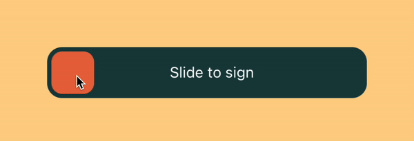
Below is our finished component:
As a bonus, we will also be adding an icon to the Knob and changing it to a different icon when it completes the track.

Initial Setup
You can create a new project or use an existing one. For the sake of simplicity, we will be using Expo for this blog. Before diving into the code, please make sure that you have the development environment set up by following the official guidelines. Please install react-native-reanimated and react-native-gesture-handler as per their setup instructions.
Building the Slider Button Component UI
In this example, we'll create a Slider Button component that allows users to slide a knob to perform an action. Before creating any animations let's create a simple horizontal button component which has a knob inside. Once we are done with the UI we will be animating the knob to perform the action we want. So let's create a simple Slider Button component.
export const SliderButton = ({
  width = 300,
  sliderHeight = 48,
  knobWidth = 40,
  padding = 4,
  label = "",
}) => {
  return (
    <View style={[styles.slider, { height: sliderHeight, width }]}>
      <View
        style={[
          styles.knob,
          { height: knobWidth, width: knobWidth, left: padding },
        ]}
      />
      <View style={styles.labelContainer}>
        <Text style={styles.text}>{label}</Text>
      </View>
    </View>
  );
};

const styles = StyleSheet.create({
  slider: {
    borderRadius: 14,
    backgroundColor: "#183F3F",
    justifyContent: "center",
  },
  knob: {
    borderRadius: 10,
    backgroundColor: "#E76A40",
    justifyContent: "center",
    alignItems: "center",
    position: "absolute",
  },
  text: {
    marginLeft: 10,
    color: "#FFFFFF",
  },
  labelContainer: {
    justifyContent: "center",
    alignItems: "center",
    flexDirection: "row",
  },
});

export default function App() {
  return (
    <View style={style.container}>
      <SliderButton
        label="Slide to sign"
        sliderWidth={300}
        sliderHeight={48}
        knobWidth={40}
        padding={4}
      />
    </View>
  );
}
As you will notice, we are using position:'absolute' to position the Knob over the button container so that it will not hinder the label's position when we slide the Knob over the label.
With all the code in place, this is how the component looks like below:

Adding the Animations 🪄
For adding animations we will be using PanGestureHandler from react-native-gesture-handler. It will allow us to track the movement of the Knob inside the SliderComponent.
We will also be using a few hooks and APIs provided by react-native-reanimated such as Animated, useSharedValue, useAnimatedGestureHandler, useAnimatedStyle, withSpring, interpolate and worklet.
Please refer to the below code in which we are using everything we discussed to animate the Knob:
<!-- imports -->
import React from 'react';
import { Alert, StyleSheet, View, Text } from 'react-native';
import Animated, {
useSharedValue,
useAnimatedGestureHandler,
useAnimatedStyle,
withSpring,
runOnJS,
} from 'react-native-reanimated';
import {
PanGestureHandler,
GestureHandlerRootView,
} from 'react-native-gesture-handler';
<!-- helper -->
const clamp = (value, lowerBound, upperBound) => {
'worklet';
return Math.min(Math.max(lowerBound, value), upperBound);
};
<!-- SliderButton Component -->
export const SliderButton = ({
width = 300,
sliderHeight = 48,
knobWidth = 40,
padding = 4,
label = '',
}) => {
const translateX = useSharedValue(0);
const totalSwipeableWidth = width - knobWidth - padding * 2;
const onGestureEvent = useAnimatedGestureHandler({
onStart: (_, ctx) => {
ctx.offsetX = translateX.value;
},
onActive: (event, ctx) => {
translateX.value = clamp(
event.translationX + ctx.offsetX,
0,
totalSwipeableWidth,
);
},
onEnd: () => {
if (translateX.value < totalSwipeableWidth / 2) {
translateX.value = withSpring(0, {
damping: 15,
stiffness: 150,
overshootClamping: true,
});
} else if (translateX.value > totalSwipeableWidth / 2 - knobWidth) {
translateX.value = withSpring(totalSwipeableWidth, {
damping: 15,
stiffness: 150,
overshootClamping: true,
});
}
},
});
const animatedStyles = {
scrollTranslationStyle: useAnimatedStyle(() => {
return { transform: [{ translateX: translateX.value }] };
}),
progressStyle: useAnimatedStyle(() => {
return {
width: translateX.value + knobWidth + padding,
};
}),
}
return (
<GestureHandlerRootView>
<View style={[styles.slider, { height: sliderHeight, width }]}>
{/* <Animated.View style={[styles.progress, animatedStyles.progressStyle]} /> */}
<PanGestureHandler
onGestureEvent={onGestureEvent}
>
<Animated.View style={[styles.knob,animatedStyles.scrollTranslationStyle, { height: knobWidth, width: knobWidth, left: padding }]} />
</PanGestureHandler>
<View style={styles.labelContainer}>
<Text style={styles.text}>{label}</Text>
</View>
</View>
</GestureHandlerRootView>
);
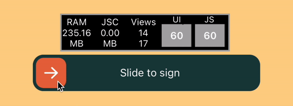
};This is what our SliderButton looks like now:
Let's see what's happening here:
- The SliderButton consists of a container, a knob, and a label. The knob's position is controlled by the animated translateX.value which is getting applied to the Knob in
scrollTranslationStyle. - We are using useSharedValue to save the initial position of the Knob, which is at the start of our slider button.
- We are wrapping our
KnobwithPanGestureHandlerand usingonGestureEventto capture the gesture.onGestureEventis an animated gesture handler that responds to user interactions like dragging the knob in our case. It uses useAnimatedGestureHandler to define the behaviour when gestures are detected. It keeps track of the offsetX and updates the translateX value accordingly inside theonActivemethod. animatedStylesis an object containing our animated styles andscrollTranslationStyleis for translating the knob horizontally. To animate the Knob, we are using the useAnimatedStyle hook which is needed to use the shared valuetranslateX.valuein reposition the Knob every time it changes. Until now all the animations are running in the UI thread and our Javascript thread is still available.- Now we want to contain the knob inside the SliderButton container so that it doesn't overflow from the button container and to do so we are using a clamp function inside the
onActivemethod ofuseAnimatedGestureHandler. It takes a value and ensures it stays within the boundaries defined by lowerBound and upperBound. If the value is less than lowerBound, it returns lowerBound, and if the value is greater than upperBound, it returns upperBound. Otherwise, it returns the value itself. But it will run on the javascript thread. If we want to run any functions in the UI thread we can use a helper provided by Reanimated called Worklets and the only thing we need to do is to addworkletdirective at the top of the function. All the other functions we are using such asuseAnimatedStyle&useAnimatedGestureHandlerare detected by Reanimated and are run on the UI thread, so we don't need to add theworkletdirective. - We are also setting the position of the
Knobto the start or end of the track, depending on where it's left while sliding and to that we are setting the value oftranslateXinside theonEndmethod fromuseAnimatedGestureHandler. To give a subtle springy animation we are using withSpring from Reanimated while setting the value to give a springy animation. - We also want to call a function once the slider reaches the end of the track and as the code needs to be run on the javascript thread, we can call our required function with runOnJS so that the code is not workletized and runs on the javascript thread.
But there is one issue with the animation; the label should be hidden until the position of the Knob in the track. To fix that we will add another Animated.View which will be a sibling of the Knob and the label and is positioned just above the label with zIndex. We will adjust it's width based on the translateX value.
const animatedStyles = {
    scrollTranslationStyle: useAnimatedStyle(() => {
      return { transform: [{ translateX: translateX.value }] };
    }),
    progressStyle: useAnimatedStyle(() => {
      return {
        width: translateX.value + knobWidth + padding,
      };
    }),
  }

<!-- rest of the code -->
<View style={[styles.slider, { height: sliderHeight, width }]}>
  <Animated.View style={[styles.progress, animatedStyles.progressStyle]} />
  <PanGestureHandler
    onGestureEvent={onGestureEvent}
  >
    <Animated.View style={[styles.knob,animatedStyles.scrollTranslationStyle, { height: knobWidth, width: knobWidth, left: padding }]} />
  </PanGestureHandler>
  <View style={styles.labelContainer}>
    <Text style={styles.text}>{label}</Text>
  </View>
</View>
And now we have a perfect animating Slider Button component.
Disabling the slider.
To disable the component we can add a prop name disabled which will be a boolean value. The gesture can be disabled the enabled prop of PanGestureHandler and add opacity to the component's main container.
Bonus (Icon animation)
We want to add an Icon to the Knob such that it will only change when the Knob is about to reach the end of the track or is at the end of the track. To do so we will use another API from react-native-reanimated called Interpolate. As per the document, interpolate approximates values between points in the output range and lets you map a value inside the input range to a corresponding approximation in the output range. To do so we need to place two different icons together inside the Knob, such that only the initial icon is visible until the Knob reaches the end while the end icon will be hidden. The end icon will be visible once the Knob is at the end of the track. For the icons, we are using @expo/vector-icons.
Let's add that functionality.
const animatedStyles = {
   <!-- previous animated styles -->

    activeIconStyle: useAnimatedStyle(() => {
      return {
        opacity: interpolate(translateX.value, [0, totalSwipeableWidth - knobWidth - padding, totalSwipeableWidth], [1, 1, 0]),
        transform: [{ translateX: interpolate(translateX.value, [0, totalSwipeableWidth - knobWidth - padding, totalSwipeableWidth], [0, 0, knobWidth]) }]
      };
    }),
    inactiveIconStyle: useAnimatedStyle(() => {
      return {
        opacity: interpolate(translateX.value, [0, totalSwipeableWidth - knobWidth - padding, totalSwipeableWidth], [0, 0, 1]),
        transform: [{ translateX: interpolate(translateX.value, [0, totalSwipeableWidth - knobWidth, totalSwipeableWidth], [-knobWidth, -knobWidth, 0]) }]
      };
    }),
  }

<!-- Knob with the icons -->
  <Animated.View style={[styles.knob, animatedStyles.scrollTranslationStyle, { height: knobWidth, width: knobWidth, left: padding }]} >
    <Animated.View style={[{ position: "absolute", }, animatedStyles.activeIconStyle]}>
      <AntDesign name="arrowright" size={24} color="white" />
    </Animated.View>
    <Animated.View style={[{ position: "absolute" }, animatedStyles.inactiveIconStyle]}>
      <AntDesign name="check" size={24} color="white" />
    </Animated.View>
  </Animated.View>
Here, we are interpolating the values of opacity and transform property to get the desired results.
Below is the finished animation after the above changes to the code, and the best part of the implementation is that all the animation are running on the UI thread with smooth 60fps animation.
Conclusion
In this blog post, we explored how to create a slider button component in React Native that leverages animation and gesture handling. By using libraries like react-native-reanimated and react-native-gesture-handler, we can create engaging and interactive user interfaces for our mobile apps. Experiment with different animations and gestures to enhance the user experience and make your app stand out.
Here is the link to the repo containing the code of the component. Happy coding!